A famous logo looks obvious once it exists. Nike’s swoosh was a $35 student commission; Mastercard is 2 circles; Target is a dot in a ring. Each one took years of the same mark, used the same way, before it could stand on its own. That repetition is what people remember, more than the shape itself.
Research on 1,162 brand assets found that shape-based assets such as logos and packaging perform best. Four in 10 people linked them to their brand and 71% did so uniquely, while colours came last at 12% and 39% (International Journal of Advertising, 2026). A logo or a pack shape is the asset most likely to do the job, if it’s simple enough to stick.
This list covers 40 famous logos, grouped by what each one gets right, with the year, the designer where known, the idea behind it and the myths to skip. The facts come from the brands’ own pages and the designers’ accounts, cited as we go. At the end, we explain how we design logos that last.
Key takeaways
- The famous logos share 4 traits: simple, distinctive, usable at any size and carrying an idea the brand can keep telling.
- The oldest have barely changed: IBM’s 8-bar logo is from 1972, the Harley-Davidson shield from 1910, the Mercedes star from 1909. The newest redraws keep the old shape.
- Hidden meanings help people remember a mark, but only after someone points them out. FedEx’s arrow and Carrefour’s C are the classics.
- Recent redesigns mostly flatten and simplify for screens: Google (2015), Mastercard (2016), Volkswagen (2019), BMW (2020), Pepsi (2023).
- Only 15% of 5,046 brand assets that Ipsos tested were truly distinctive. The logos below show what distinctive looks like.
What the famous logos have in common
Put the 40 logos side by side and the same 4 traits show up every time.
- Simple. You can draw the apple, the swoosh or the arches from memory. Simple shapes survive bad printing, small screens and other people’s copies.
- Distinctive. Nothing else in the category looks like it. That’s rare: of 5,046 brand assets that Ipsos tested for the design agency JKR, only 15% were truly distinctive (JKR, 2023).
- Works at any size. From a favicon to a billboard, in colour and in one colour. Google and YouTube both redrew their marks to work “even on the tiniest screens”.
- Carries an idea. A story the brand can keep telling: Daimler’s star for land, sea and air, Audi’s 4 rings for 4 companies, Tesla’s T as a motor. The story keeps the mark meaningful long after the novelty wears off.
Simple enough to draw from memory
The first group proves the first trait. Each of these marks is one shape, and each has stayed that shape for decades.
1. Apple
Rob Janoff, an art director at the Regis McKenna agency, drew the apple in early 1977, and it launched with the Apple II that April. The bite is for scale: “so people get that it was an apple not a cherry” (Janoff, 2009 interview). It isn’t a pun on “byte” (his creative director pointed that out afterwards), and it doesn’t honour Alan Turing. The rainbow stripes showed off the Apple II’s colour display; the one-colour silhouette used today is Janoff’s shape with the small adjustments Landor & Associates made in the early 1980s, he says. What it gets right: one silhouette, changed only slightly since 1977.
2. Nike
In 1971 Phil Knight turned to Carolyn Davidson, a design student he’d met while teaching accounting at Portland State. The group settled on her curving checkmark; she thought it suggested motion. Knight told her “Well, I don’t love it,” and that “it will grow on me.” Davidson sent him an invoice for $35 (Nike, 2025). The “wing of the goddess Nike” story appears in neither Nike’s account nor hers. What it gets right: movement, in one stroke.
3. McDonald’s
The arches were a building before they were a logo. Architect Stanley Meston designed the red-and-white tiled restaurant in 1953. Dick McDonald added arches because the roofline felt “a bit too flat”, and a sign maker “incorporated yellow neon into them creating the ‘Golden Arches’” (McDonald’s). The 2 arches, seen at an angle, became the M in 1962. The story that a psychologist designed them as a mother’s breasts is false: Louis Cheskin only advised keeping them in the 1960s. What it gets right: a letter you can read from the highway.
4. Shell
Shell’s mark “started life as a black and white mussel shell” in 1900, became a scallop in the early 1900s and “was given a more formal design” in 1930. In 1971 Raymond Loewy drew the Pecten “recognisable today” and moved the name below the symbol, “in a specially designed typeface”. The current red and yellow came in the early 1990s (Shell). Shell itself calls the origin of the colours uncertain. What it gets right: Loewy’s symbol reads without the name, which is why the name could leave it.
5. Target
When Dayton’s planned a new discount store in 1962, its publicity director Stewart K. Widdess and his staff “considered more than 200 potential names”, came up with Target and “immediately envisioned a classic bullseye logo” (Target). The first store opened in Roseville, Minnesota, on 1 May 1962; the bullseye was simplified in 1968, and Target credits no outside agency. What it gets right: the name and the mark are the same idea, learned at the same time.
A second meaning in the mark
Some logos carry a second image in their negative space or their letters. The logo works without it, but once people notice it, they never see the logo the same way again.
6. FedEx
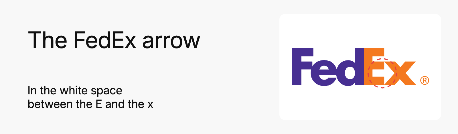
Lindon Leader, senior design director at Landor’s San Francisco office, designed the wordmark in 1994 (ArtCenter). The arrow between the E and the x emerged mid-process, from one of more than 200 designs. Leader rebuilt the letterforms, a hybrid of Univers 67 and Futura Bold, so the arrow would sit naturally, and kept it unfilled on purpose. “The power of the hidden arrow is simply that it is a hidden bonus. It is a positive-reverse optical kind of thing: either you see it or you don’t” (Leader, 2004 interview). FedEx’s own history page doesn’t mention it. What it gets right: a second meaning that costs the wordmark nothing.
7. Amazon
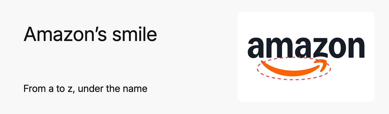
Amazon introduced the smile on 25 January 2000, designed by Turner Duckworth from a 1998 brief by Jeff Bezos, when the bookseller “was going to sell everything” (Turner Duckworth). The press release spelled out the second meaning: “a smile now begins under the a and ends with a dimple under the z, emphasizing that Amazon.com offers anything, from A to Z” (Amazon, 2000). What it gets right: it says 2 things with one line, and the brand said both out loud.
8. Carrefour
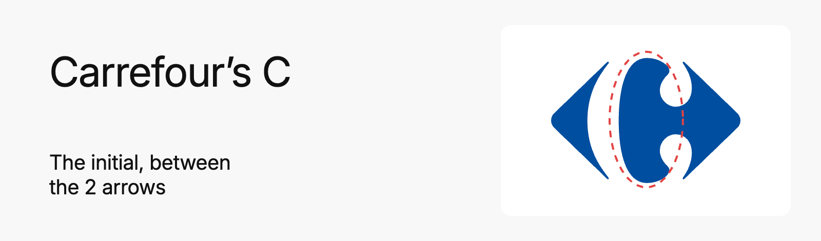
Carrefour’s mark was created in 1966 for the opening of its Vénissieux hypermarket, by the typographer Jacques Daniel with Étienne Thil, the company’s first communication director (the designer’s estate). Carrefour describes it as “the ‘C’ for Carrefour, in the middle of a diamond, red to the left, blue to the right, with black lines at the top and bottom”. Then “the black lines disappeared making the ‘C’ less obvious” (Carrefour), which is why most people see 2 arrows and miss the letter. The card shows the one-colour version. What it gets right: the initial, hidden in plain sight.
9. Toyota
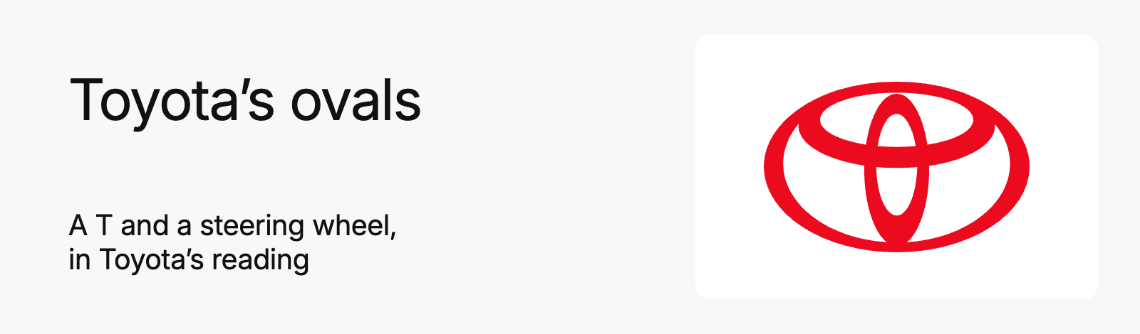
Toyota’s 3 ovals debuted in October 1989 for the company’s 50th anniversary, after about 5 years of development (Toyota). Toyota’s own reading: the 2 inner ovals are the heart of the customer and the heart of the company, overlapped “to represent a mutually beneficial relationship and trust between each other”. Together they form a T and a steering wheel, and the outer oval is the world. The popular claim that every letter of T-O-Y-O-T-A hides in the ovals comes from outside sources, not from Toyota. What it gets right: a mark that explains the company’s relationship with its customers in one shape.
10. Baskin-Robbins
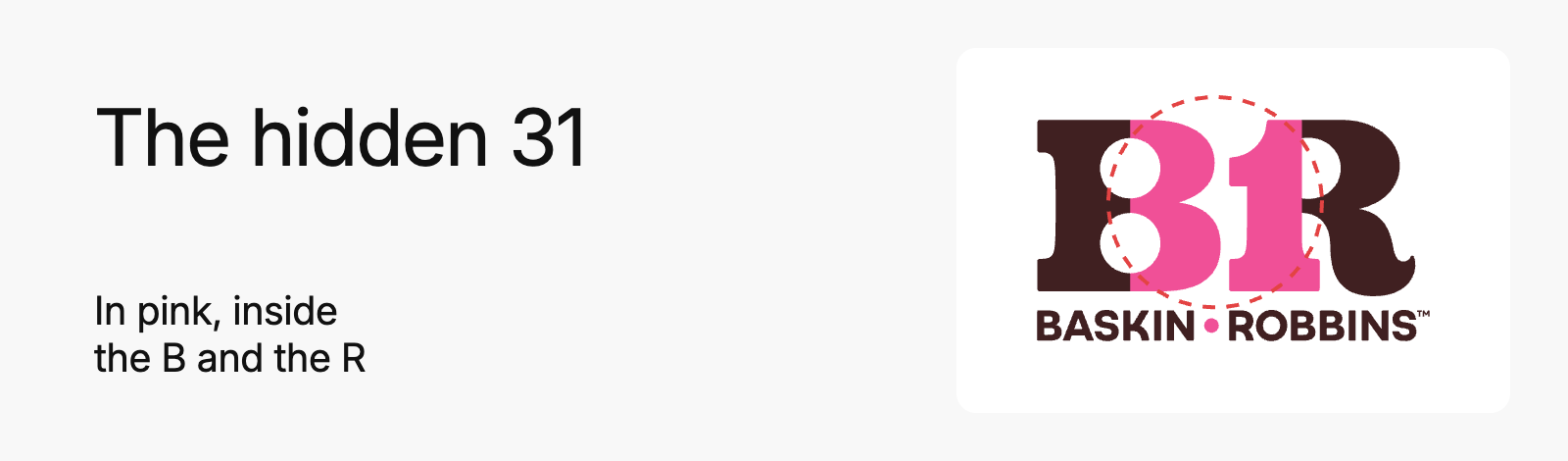
The 31 has been in the logo since 1953: “31 flavors available on scoop in any location, allowing guests to enjoy a different flavor every day of the month” (Inspire Brands, the parent company). The 2006 BR monogram buried the number inside the letters, in pink. The 2022 identity by ChangeUp kept it, “retaining the ‘31’ built right into the BR monogram itself”, and brought back the original pink and brown (ChangeUp). What it gets right: a 70-year-old promise, hidden where regulars find it.
11. Tour de France
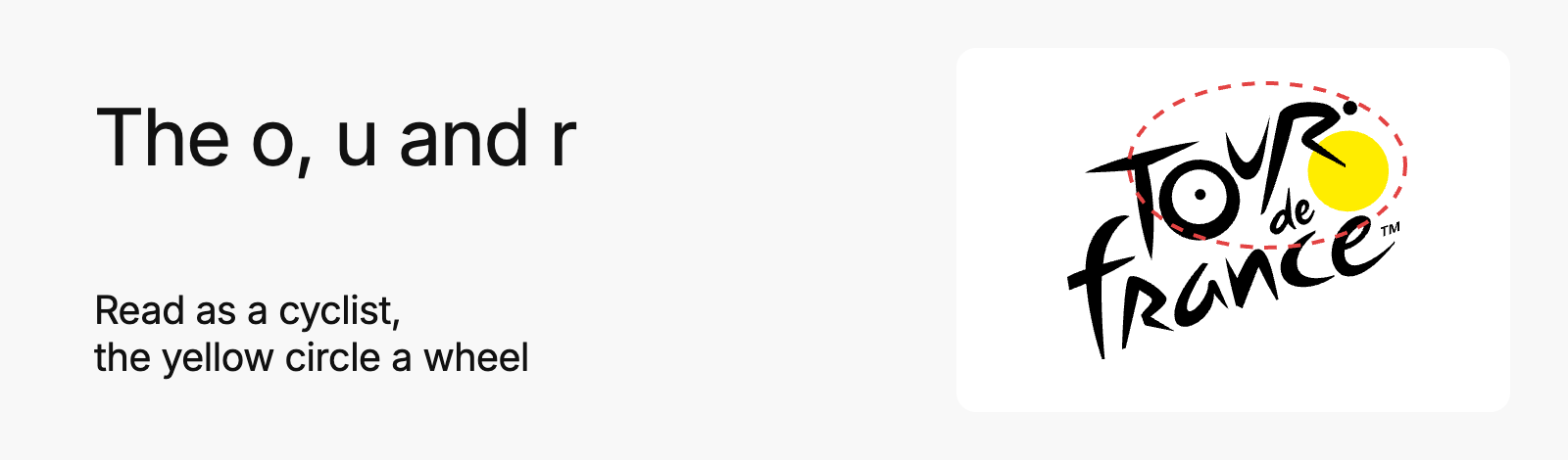
Joël Guenoun designed the mark in 2002, first used for the centenary race in 2003 and refreshed in 2019. Inside the word “Tour”, the o, the u and the r draw a cyclist with the yellow circle. The o is the rear wheel, the circle the front wheel, the r the rider (Creative Bloq; Journal du Net). That reading comes from the design press; we found no statement from the organizer, ASO, about the cyclist. What it gets right: the sport is inside the name.
12. Formula 1
Wieden+Kennedy London, led by Richard Turley and Tony Davidson, unveiled the mark on 26 November 2017 at the Abu Dhabi Grand Prix. It is “constructed from three simple shapes that form an ‘F’ and a ‘1’ and that evoke both the speed of the cars and the bends of a racetrack” (Creative Review, 2017). The negative-space 1 people remember belongs to the previous mark, Carter Wong’s from 1994. What it gets right: 3 shapes that read as 2 characters and as speed.
13. NBC
Chermayeff & Geismar’s peacock went on air on 12 May 1986, at the end of NBC’s 60th-anniversary special. The designers simplified the bird, reduced the feathers “from eleven to six” and coloured them with “the primary and secondary colors of television” (Chermayeff & Geismar & Haviv). Each feather also stood for a division at the time, former NBC marketing chief John Miller told Variety. The body is a feather in negative space. The 1956 bird promoted colour TV and was never treated as a logo. What it gets right: 6 colours that sell what the network sold.
14. Beats
Ammunition, the design firm of ex-Apple designer Robert Brunner, started working with Beats in 2006 on product design and “the visual design and out-of-box experience of the packaging” (The Dieline; Ammunition). We found no credit for whoever drew the b. The red circle with a lowercase b is widely read as a head in profile wearing headphones. Neither Beats nor Ammunition has said so in anything we could find. Treat it as a reading, not a fact. What it gets right: a single letter that works as an app icon and as the badge on the ear cup.
15. Mitsubishi
The name is the mark. Mitsubishi explains it on its own site: “Mitsu means ‘three.’ Hishi means ‘water chestnut,’ and Japanese have used the word for a long time to denote a rhombus or diamond shape.” Founder Yataro Iwasaki chose the 3 diamonds as the emblem for his company, a mark that now embodies “over 150 years of tradition”, and Mitsubishi says it “is suggestive of the three-leaf crest of the Tosa Clan, Yataro’s first employer, and also of the three stacked rhombuses of the Iwasaki family crest” (Mitsubishi). What it gets right: 3 shapes, 1 colour and a name that spells the logo out loud.
16. Unilever
Wolff Olins built the U out of 25 small icons in 2004, with creative director Lee Coomber and icons drawn by Miles Newlyn. Implementation began on 1 July 2004 (Design Week, 2004). Unilever: “From a lock of hair symbolising our shampoo brands to a spoon, an ice cream, a jar, a tea leaf, a hand and much more, the little icons all have a meaning” (Unilever). What it gets right: a corporate mark that shows what the company makes.
A colour you own
Colour is the weakest asset on its own, as the research above shows. These 4 brands own theirs anyway, because they have used the same colours, everywhere, for longer than most of their customers have been alive.
17. Coca-Cola
Frank M. Robinson, John Pemberton’s partner and bookkeeper, named the drink and “experimented in writing out an adaptation of the elaborate Spencerian script”. His colleagues adopted it “by unanimous consent”, and the company’s trademark chronology starts in 1887 (The Coca-Cola Company). He wasn’t a designer. In 1915 the bottlers asked for a second asset, a bottle “so distinct that you would recognize” it “by feel in the dark or lying broken on the ground” (The Coca-Cola Company). What it gets right: a script and a red that belong to one company.
18. Starbucks
Terry Heckler drew the first siren in 1971, “surrounded by our name (then ‘Starbucks Coffee, Tea, and Spices’)”, and redrew her in 1987, when green replaced brown. In 2011 the name left the ring: “our Siren, now so familiar, can surely stand on her own” (Starbucks Archive). Starbucks describes her as “a siren, a seductive twin-tailed mermaid from Greek mythology” and quotes Heckler: “the perfect metaphor for the siren song of coffee that lures us cupside” (Starbucks). What it gets right: a green that belongs to one coffee company, and a symbol strong enough to drop the name.
19. IKEA
IKEA’s first logo was created in 1951, round and red, because Ingvar Kamprad “liked the color red because it represents low price” (IKEA). The name is an acronym: Ingvar Kamprad, Elmtaryd, Agunnaryd, his farm and his parish. Gillis Lundgren produced “the embryo of the logo we know today” in 1952. The oval and the heavy letters came between 1962 and 1965, and blue and yellow arrived in the 1980s (IKEA Museum). The latest refinement, in 2018 and 2019, was by Stockholm’s Seventy Agency. What it gets right: 2 colours that say Sweden before you read the name.
20. Tiffany & Co.
Tiffany’s famous asset is the colour, not the serif wordmark. Tiffany trademarked the colour in 1998 and worked with Pantone in 2001 to create “1837 Blue”, named for the founding year (Tiffany & Co.; Tiffany press). Why Charles Lewis Tiffany chose it, the company says, has no definitive answer. What it gets right: one colour on everything, for so long that the box sells the ring.
The wordmark is the brand
The name itself, set in letterforms of its own, with at most a small icon beside it. A wordmark has one advantage over a symbol: people learn the name at the same time as the mark.
21. Google
Google introduced its current wordmark on 1 September 2015, replacing the serif with a custom geometric sans-serif designed in-house. Its designers kept 2 things from the old mark: the multi-colour sequence and the tilted “e”, “a reminder that we’ll always be a bit unconventional” (Google Design). The brief was a logo that works “even on the tiniest screens”, where the same letterforms shrink to a single “G” (Google, 2015). What it gets right: it changed the type and kept what people recognize.
22. Disney
The script isn’t Walt Disney’s signature. D23, the company’s official fan club, calls it “a stylized version of Walt’s actual signature”. One colleague recalled Walt practising signing his name in various styles early in his career (D23). No Disney page dates the wordmark. Historians put the signature-style title at around 1937, with Snow White, and the familiar form in the early 1970s (Creative Bloq). What it gets right: a founder’s hand, turned into a mark the company can draw the same way every time.
23. Visa
Visa was founded more than 60 years ago, when “few could imagine a world beyond cash and checks” (Visa, 2021). Its 2021 refresh, built with the design firm Mucho, added “refreshed colors for digital impact, a custom font created for optimal digital experiences and an updated brand symbol”. The story that the old blue and gold stood for California’s sky and hills circulates on logo blogs with no Visa source behind it. What it gets right: 4 letters that read on a card, a terminal and a phone.
24. IBM
Thomas J. Watson Jr., who coined the phrase “good design is good business”, hired Paul Rand in 1956. Rand’s first IBM logo was a solid wordmark in City Medium. The 8-bar version came in 1972, “the three letters of the company name rendered in eight (and sometimes 13) horizontal lines” (IBM). IBM says it has remained “unchanged since 1972”. What it gets right: the stripes give a heavy wordmark lightness and rhythm, and in 50 years it has not needed a redraw.
25. YouTube
YouTube’s 2017 logo “combines a cleaned up version of the YouTube wordmark and Icon, creating a more flexible design that works better across a variety of devices, even on the tiniest screens”, wrote Chief Product Officer Neal Mohan (YouTube, 2017). When room is limited, the red play button stands alone as the logo. What it gets right: the icon was always there; the redesign let it carry the brand on its own.
Symbols with a story
A symbol with a story gets retold for free. Each of these has an origin story, told by the brand or argued over by historians, and a few have myths the brand has had to correct.
26. BMW
The roundel dates from 1917, and its blue and white quarters are the colours of Bavaria. The spinning propeller, BMW has said, stems from an advert published in 1929, long after the mark existed (Creative Bloq, reporting BMW). In March 2020 BMW added a flat, transparent version for its communication: “pared-down and two-dimensional, it conveys openness and clarity”. BMW says it won’t be used on the vehicles (BMW Group, 2020). What it gets right: 100 years of the same circle, with a lighter version only where screens need it.
27. Mercedes-Benz
Gottlieb Daimler once drew a star on a postcard of the family home. After his death, his sons Paul and Adolf turned it into the trademark, “intended to symbolise Gottlieb Daimler’s vision of motorisation ‘on land, on water and in the air’” (Daimler Truck heritage release). Daimler-Motoren-Gesellschaft (DMG) applied to protect the star in 1909, and it entered the trademark register in 1911. The star in a ring was filed on 5 November 1921, and the laurel wreath came with the Benz merger in 1926. Not 3 founders, and not Daimler, Mercedes and Benz. What it gets right: 3 points, 1 idea and a shape that works as a hood ornament.
28. Audi
Audi’s 4 rings represent “the inseparable unity of the four founding companies”: Audi, DKW, Horch and Wanderer, merged into Auto Union on 29 June 1932 (Audi, 2022). In 2022 the rings went flat. The Q8 e-tron was the first car to carry them: “although the size remains the same, the new rings have a more precise appearance” (Audi). Not 4 brothers, and nothing to do with the Olympics. What it gets right: a merger told in one glance.
29. Volkswagen
The V stacked on the W in a circle goes back to the late 1930s; who drew it is disputed, and secondary sources credit Porsche engineer Franz Xaver Reimspiess. In September 2019 Volkswagen flattened it (MetaDesign says it led the creative development) and gave the brand a sound logo “for the first time” (Volkswagen Newsroom, 2019). What it gets right: 2 letters, a circle and no chrome to get in the way on a screen.
30. Harley-Davidson
The Bar & Shield was filed with the US Patent Office on 19 July 1910 and, a later filing states, had been used “since May 6, 1910”. Harley-Davidson’s own archive says that “no archival records have confirmed who designed the logo nor what inspired them” (H-D Archives). Black and orange arrived around 1922; the present version dates from 1976, revived from a 1931 patch. What it gets right: a shield that looks right on a tank, a jacket and a tattoo.
31. Ferrari
Francesco Baracca, Italy’s First World War flying ace, painted a prancing horse on his plane. Enzo Ferrari wrote: “One day the Countess said to me, ‘Ferrari, why don’t you put my son’s prancing horse on your cars? It’ll bring you good luck.’ The Horse was and will always be black; I added the canary yellow background, the colour of the city of Modena” (Ferrari). The horse first appeared on Scuderia Ferrari’s Alfa Romeos on 9 July 1932, and Ferrari took it as its badge in 1947 (Ferrari). The card shows the one-colour horse. What it gets right: a borrowed symbol with a story told in Enzo Ferrari’s own words since his 1962 memoir.
32. Firefox
The first Firefox logo shipped with version 0.8 on 9 February 2004: Daniel Burka’s concept, a sketch by Stephen Desroches, rendered by Jon Hicks in Fireworks (Hicks’s own account). On 11 June 2019 Mozilla introduced a parent brand, because “the ‘Firefox’ you’ve always known as a browser is stretching to cover a family of products and services” (Mozilla, 2019). What it gets right: a mascot simplified until it works at icon size.
33. LEGO
The name is Danish, LEG GODT, “play well”, chosen by founder Ole Kirk Kristiansen in late 1935 and used from January 1936. LEGO says he “allegedly” held a naming competition and won it himself (LEGO History). The red square with white letters got its “graphic facelift” in 1973. Designers removed the word “system” and the 5 coloured stripes, tightened the rounded lettering and added the black and yellow double contour (LEGO History). A refinement followed in 1998. What it gets right: it looks like the toy.
34. Adidas
Adi Dassler registered a shoe with the 3-Stripes in 1949, the year he founded adidas. The Trefoil arrived in 1972 (adidas Group) and the 3-bar mark on the card is its performance logo. The stripes’ trademark rights may have been bought: the Finnish brand Karhu says it “sells its three stripes trademark to a now well-known athletic shoe company” in the early 1950s (Karhu); we found no confirmation from adidas. The story that the price was 2 bottles of whisky is unconfirmed. What it gets right: 3 lines that work on a shoe, a shirt and a stadium roof.
35. Puma
Caricaturist Lutz Backes drew the leaping cat in December 1967 at Nuremberg Zoo, and it isn’t quite a puma. “I was waiting for the puma to jump, but it didn’t,” he told PUMA. He spotted a black panther instead and drew “the panther with the head, tail and paws of a puma” (PUMA). The cat took “its first leap across the upper right corner of the PUMA word logo” in 1968. What it gets right: motion, in one silhouette.
36. Tesla
The T is “like a cross section of an electric motor”, Elon Musk wrote on 19 January 2017 (Musk on X), and we found no fuller explanation from Tesla. RO Studio, which also drew the SpaceX logo, designed it inside a shield that Tesla later dropped (Electrek). What it gets right: a letter that is also a diagram of the product.
37. Airbnb
On 16 July 2014 Brian Chesky introduced the Bélo, “the universal symbol of belonging”, created with the London agency DesignStudio. He called it “a symbol for us as a community” that, “like us, can belong wherever it happens to be” (Chesky, 2014). The agency wanted a mark “simple enough to be drawn by anyone” (DesignStudio). What it gets right: a symbol hosts can draw on a napkin.
Logos that changed well
Redesigns are where famous logos go wrong. These 3 changed and kept what people recognized.
38. Pepsi
On 28 March 2023 Pepsi unveiled “the first update of the iconic Pepsi globe logo in 14 years”, in time for its 125th anniversary (PepsiCo, 2023). The wordmark moved back inside the globe and black came in for Pepsi Zero Sugar. The “pulse” around the globe stands for the ripple, pop and fizz of the drink. Chief Design Officer Mauro Porcini described it as “marrying distinction from our history with contemporary elements”. What it gets right: it looks like the 1990s logo people liked, drawn for 2023.
39. Mastercard
Since 1968 the mark has been “two interlocking circles in red and yellow” (Pentagram). Pentagram’s 2016 redesign, led by Michael Bierut and Luke Hayman, lowercased the “c” “to de-emphasize how the brand is no longer just a card”. It also switched the overlap to a brighter additive mix. In January 2019 Mastercard dropped its name from the symbol “in select contexts” (Mastercard, 2019). What it gets right: 2 circles that need no name.
40. Instagram
Instagram’s 2016 icon was done in-house (Brand New, 2016). Instagram said the new icon “represents a simpler camera and the rainbow lives on in gradient form” (quoted by Creative Bloq). The 2010 original, drawn by co-founder Kevin Systrom, was a vintage camera. What it gets right: it kept the camera and the rainbow and lost the detail.
How we design a logo that lasts
None of these brands got famous because of the logo. The logo became famous because the company kept it, used it everywhere and gave people reasons to remember it. This is how we work on a logo at Webgamma with that in mind, and what we’ve learned about the ones that don’t last.
Start with the business, not the logo
Before anyone sketches, we need to know what the company does, who it’s for and where it’s going in the next few years. A logo has to fit the company it’s becoming, not only the one it is today. We look at the mission, the values and the feeling people should leave with. Then we study the audience and the competitors’ colours, logos and type, to know what not to look like. We also ask where the logo will live most: an app icon, a box, a storefront or a pitch deck.
A good brief describes the business and the people. A weak one describes the logo: “something modern”, a mood board of other companies’ marks or a list of things the logo has to show.
Show 3 different ideas, then refine one
We usually show 3 directions, and each is a different idea, not 3 versions of the same one. We show them on real things, such as an app icon, a business card and a sign, because nobody judges a logo floating on a white page. The client picks one and we refine it: the drawing, the spacing, the weight and how it holds up when it’s small. Mixing the symbol from one direction with the type from another rarely works. You get something weaker than both.
Choose between the name and a symbol
For a new company, the name usually comes first. People have to learn what you’re called before a shape can stand in for you. Apple’s apple and Nike’s swoosh stand alone after decades next to the name, and Starbucks took its name off the logo after 40 years. A symbol earns its place when the logo has to live in a small square, like an app icon or a profile picture, or when the name is long or generic. Most companies end up with both: the full logo and a symbol or monogram for small spaces.
Test it before calling it done
A logo isn’t done until it passes every one of these:
- it still reads at favicon size;
- it works in one colour, black on white and white on black;
- it holds up on a photo and at the size of a sign;
- it works on the real materials, such as embroidery on a shirt, a label on a bottle or a printed box;
- someone can draw it from memory after seeing it a few times.
The spacing changes with the size, and the logo needs clear space around it. If it fails one test, we go back to the drawing.
Say one thing
The request that weakens a logo most often is trying to say everything: every service in one mark, a literal picture of the product, 3 or 4 colours, a gradient. Close behind are the trend of the year, which dates fast, and a hidden meaning for its own sake. FedEx’s arrow works because nobody needs to see it, not because someone forced it in. We don’t argue taste. We show the logo at favicon size and in one colour next to the simpler option, and the simpler one wins. The logo doesn’t have to explain the business; the name, the website and the work do that.
Hand over the system, not only the file
With the logo we hand over:
- colour, monochrome and inverted versions, plus the symbol on its own;
- clear space and minimum sizes;
- the colour palette and typography;
- a brand guide that shows how to use all of it;
- files for print and screens, including the favicon and the app icon.
When the project needs them, the materials come too: stationery, social templates and packaging. When a client skips the guide, someone stretches the logo, recolours it, puts it on a busy photo or draws their own version for social media. A year later there are 5 logos, the opposite of what made the 40 above famous.
The one we’d show a client
Mastercard. It’s 2 overlapping circles, about as simple as a logo gets. It works at any size and still reads in one colour, and Pentagram’s 2016 redesign kept what people already knew. In 2019 Mastercard began using the symbol without its name, with “more than 80 percent of people spontaneously recognizing the Mastercard Symbol without the word” (Mastercard, 2019). That’s the whole lesson: start simple, stay consistent and change less than you want to. For a startup we’d also show Target, where the name and the mark are the same idea, so people learn both at once.
Our post on what a brand is covers where a logo fits among the other parts of a brand. If you’re building an identity, our branding services cover the research, the logo with every version and the guide that keeps it consistent. For early-stage companies, our guide to startup branding goes further.