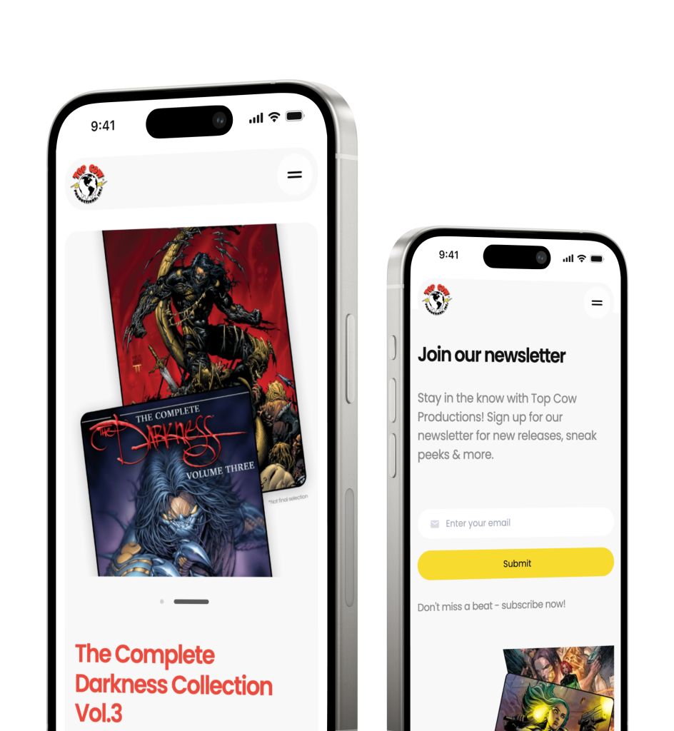


The company offers a cloud-based Customer Data Platform (CDP) that helps businesses unify customer data from both online and offline sources into a single, comprehensive profile. This centralized view enables brands to personalize customer interactions and make informed, data-driven marketing decisions.
Colors & typography
Colors and typography were selected to enhance usability and shape the user’s experience. These choices were formalized in a design system to ensure consistency across every part of the platform’s user interface.


Carried out a full platform redesign with enhanced user experience, a new design system, and a streamlined onboarding flow
Usability and onboarding issues
The platform’s outdated design made navigation difficult, slowed users down, and lacked visual consistency. Data was hard to interpret, and the onboarding flow confused new users.
Our UX research team addressed these issues by rethinking the user experience, simplifying data visuals, and creating a clearer onboarding experience.

User interface
The legacy design lacked clarity and ease of use, negatively impacting user efficiency.

Visual language
A lack of structural coherence across the UI made it difficult for users to navigate and find key features.

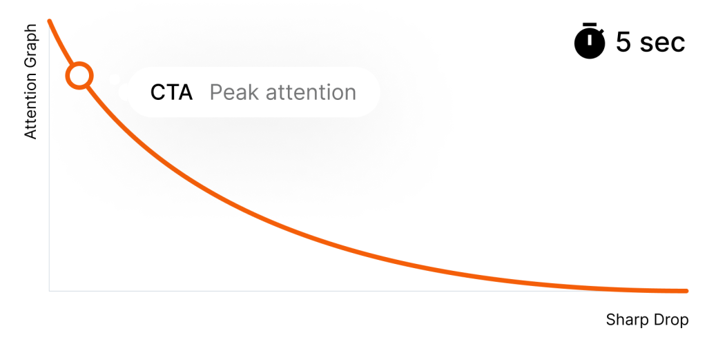
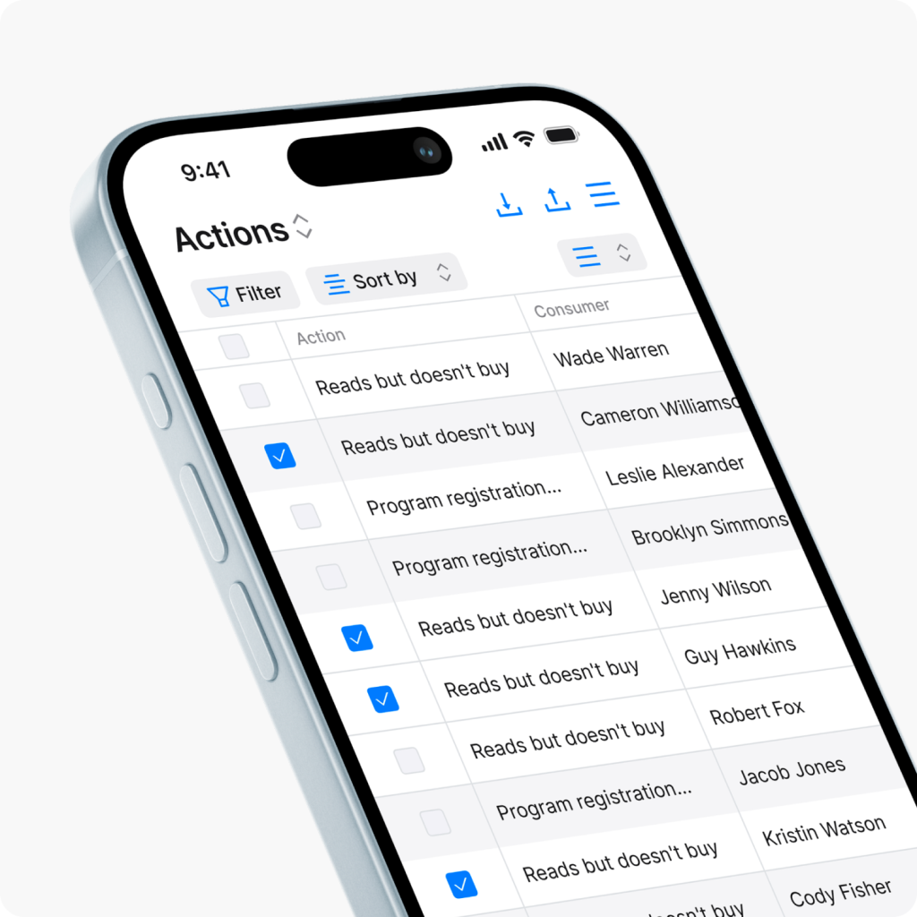
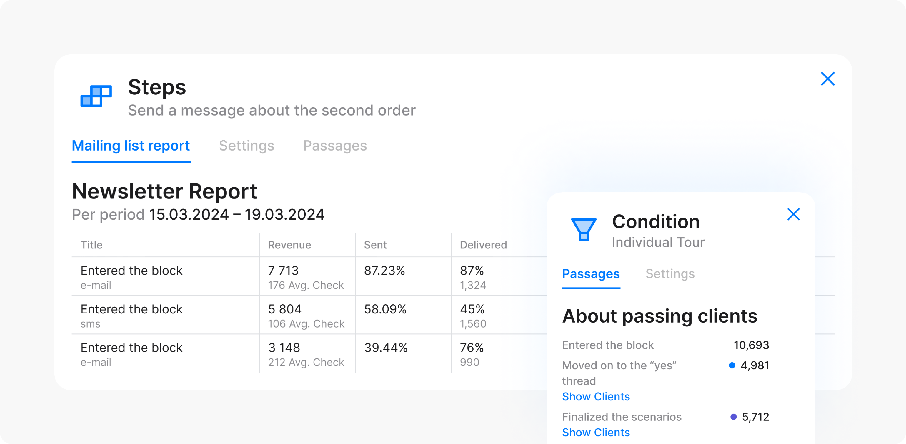
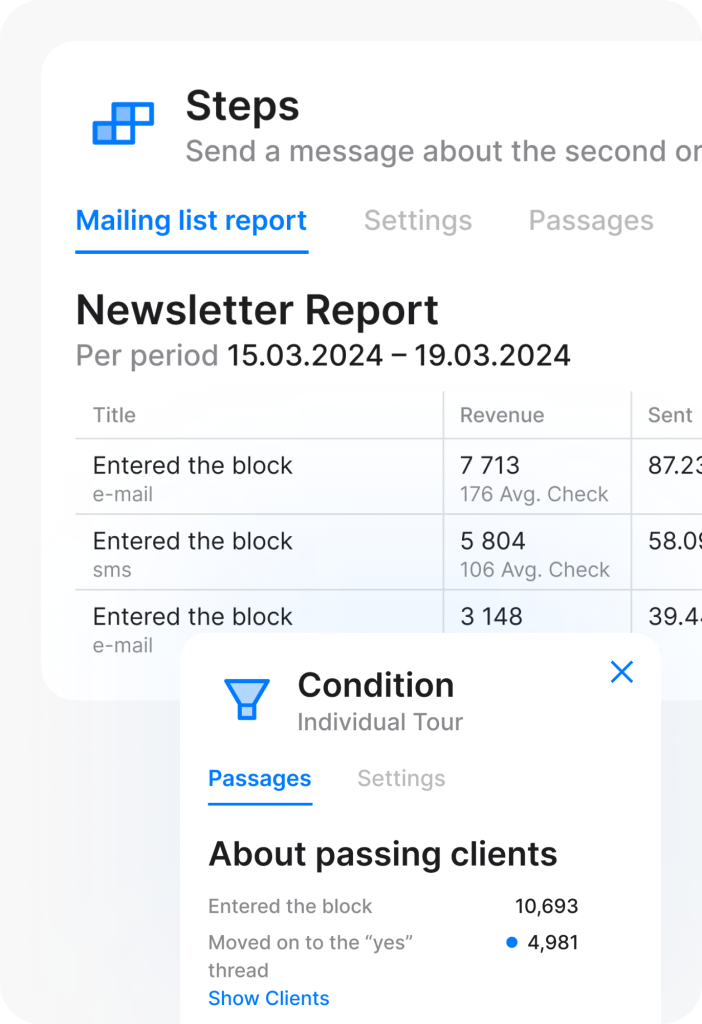
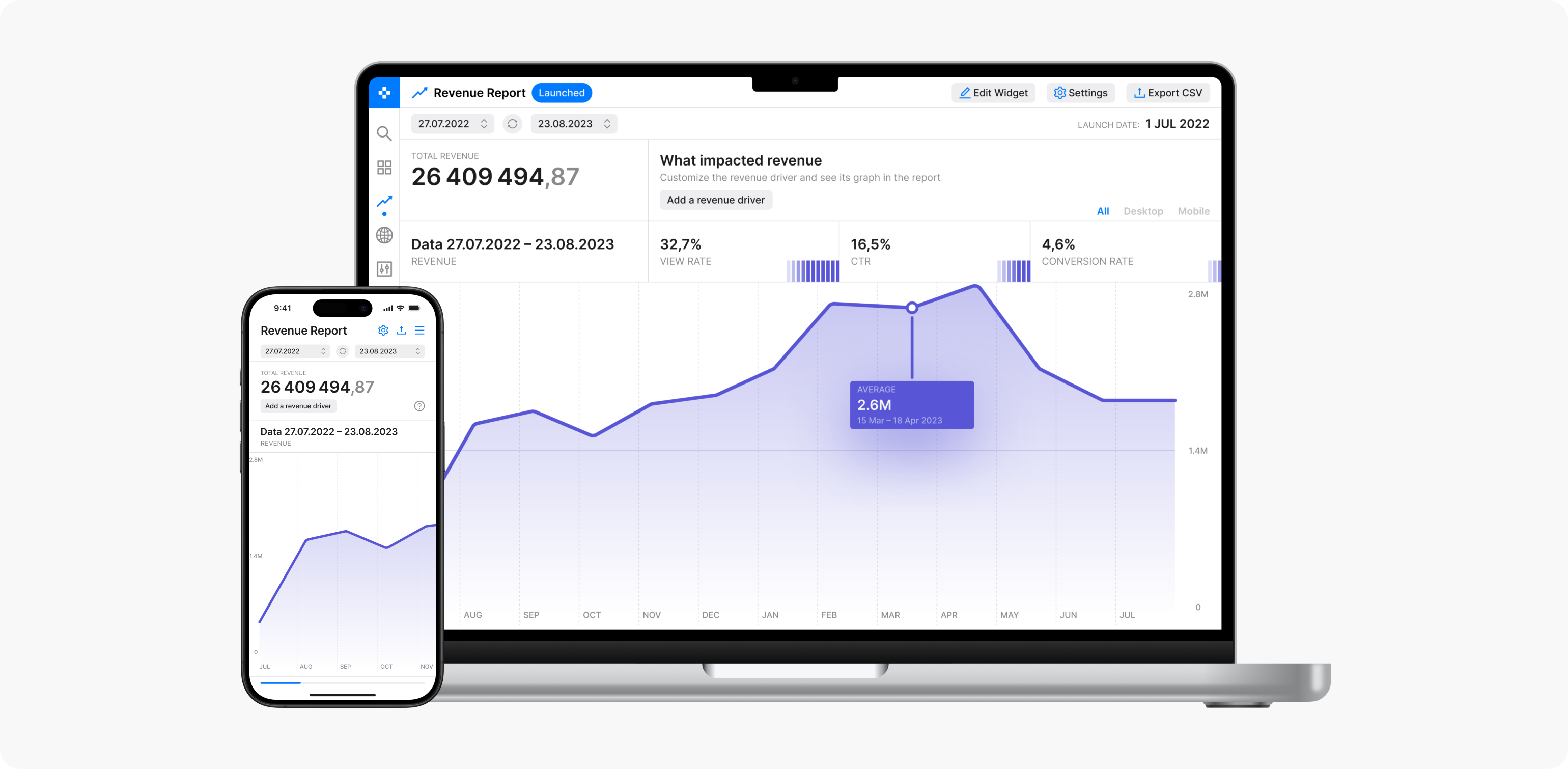
Data visualization
Overcomplicated and uninformative charts hindered data analysis and slowed decision-making.

Onboarding
New users faced steep learning curves due to the absence of clear guidance and intuitive onboarding flows.
UX redesign goals and strategic focus
Our goal was to align the platform with modern UI standards while transforming it into a reliable, user-centric tool that supports users in their daily workflows.
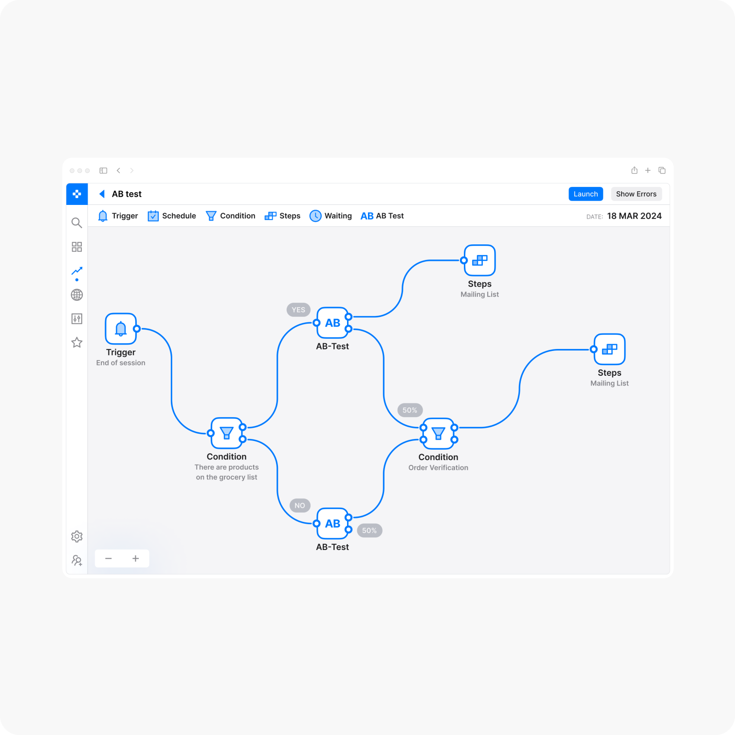
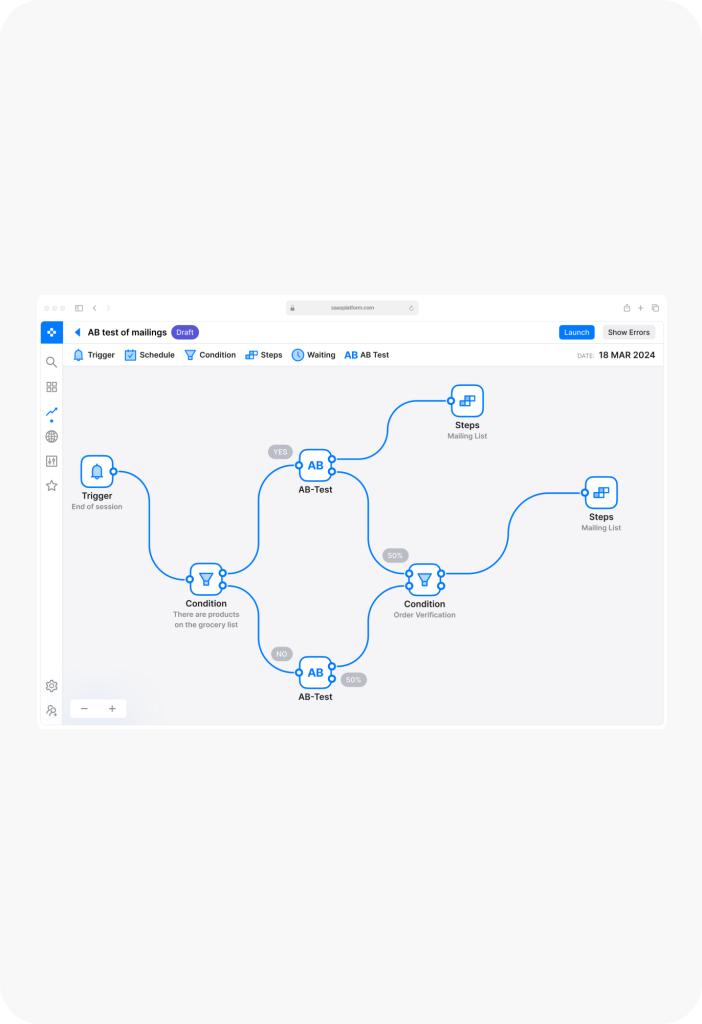
User scenarios
The primary goal was to identify pain points in user interactions and design an intuitive interface that reduces cognitive load, making scenario creation clear and accessible.
User productivity
An equally important objective was to streamline workflows, enabling users to complete tasks more efficiently and with less friction.

Analytical functionality
Given the platform’s reliance on data, enhancing tools for visualization and analysis was a top priority to support smarter, data-driven decisions.
Deliverables
The redesign was driven by a clear set of objectives aimed at aligning the platform with modern usability standards. Each milestone in the process contributed to a solution that not only meets current design expectations but also elevates the overall user experience.

UI audit
Conducted a comprehensive audit of the existing user interface. This included evaluating layout structure, navigation patterns, visual design, and key user engagement metrics.

Design system
Built a new design system to unify all interface elements. This system streamlines development, ensures consistency across components, and simplifies long-term maintenance.

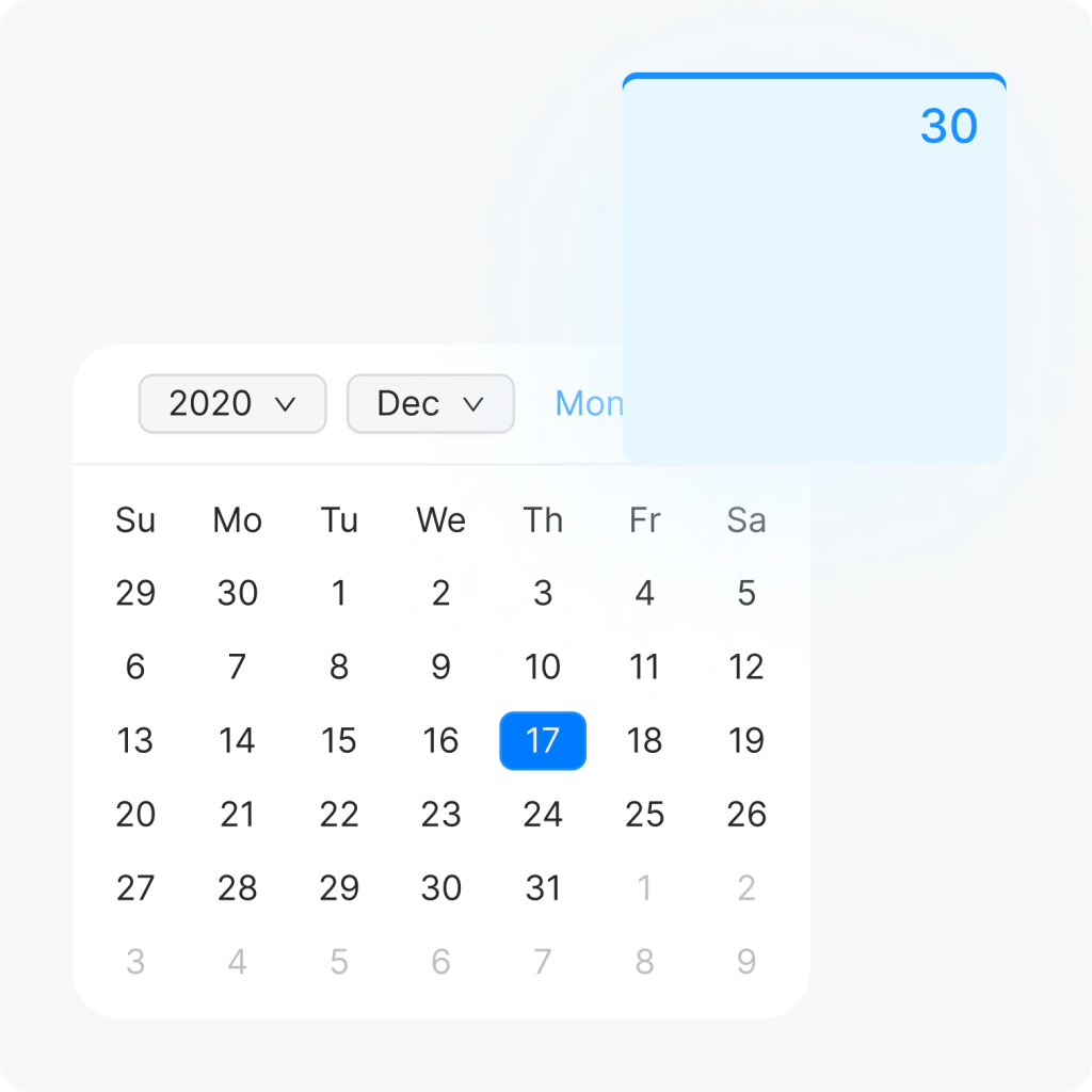
UX flows
Refined key user journeys to reduce friction and improve efficiency. The updated flows were designed to help users achieve their goals with greater ease and clarity.

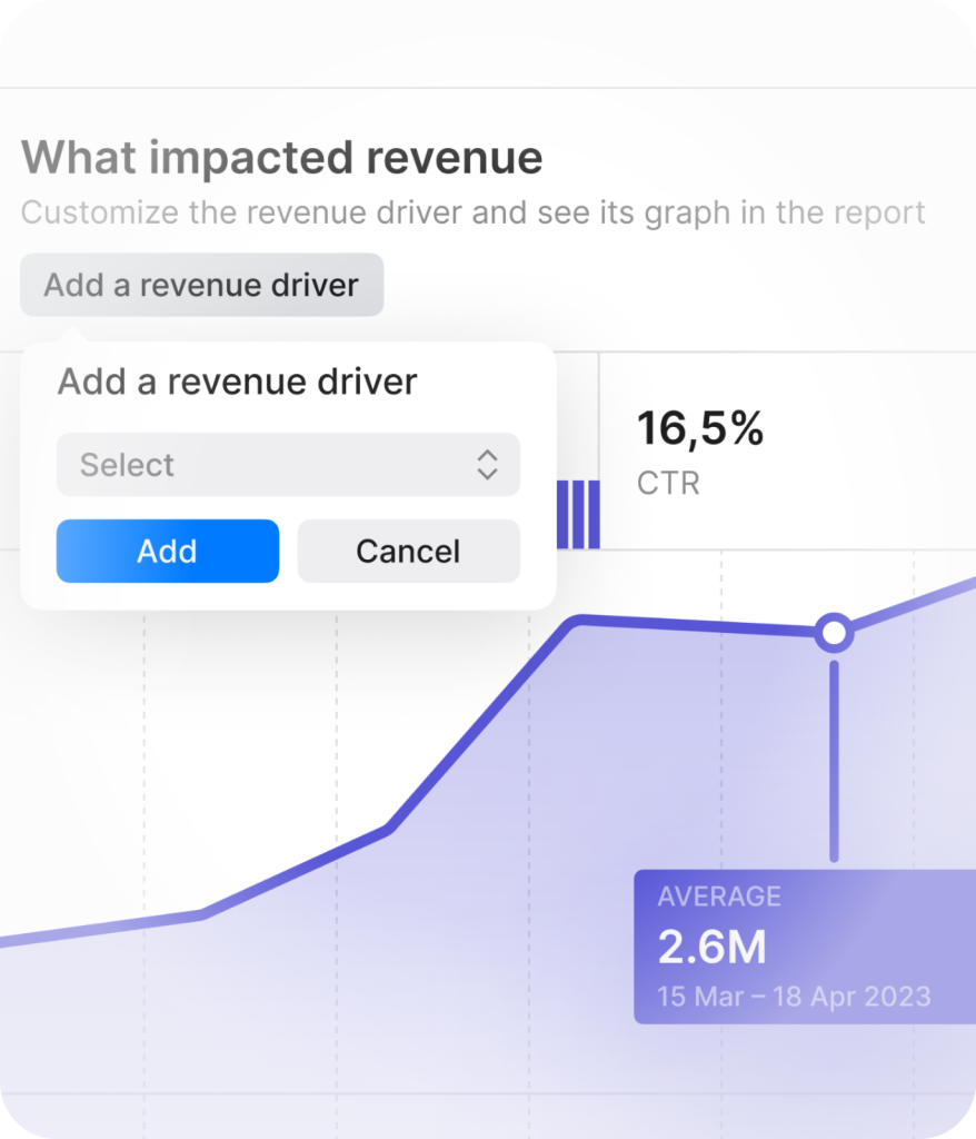
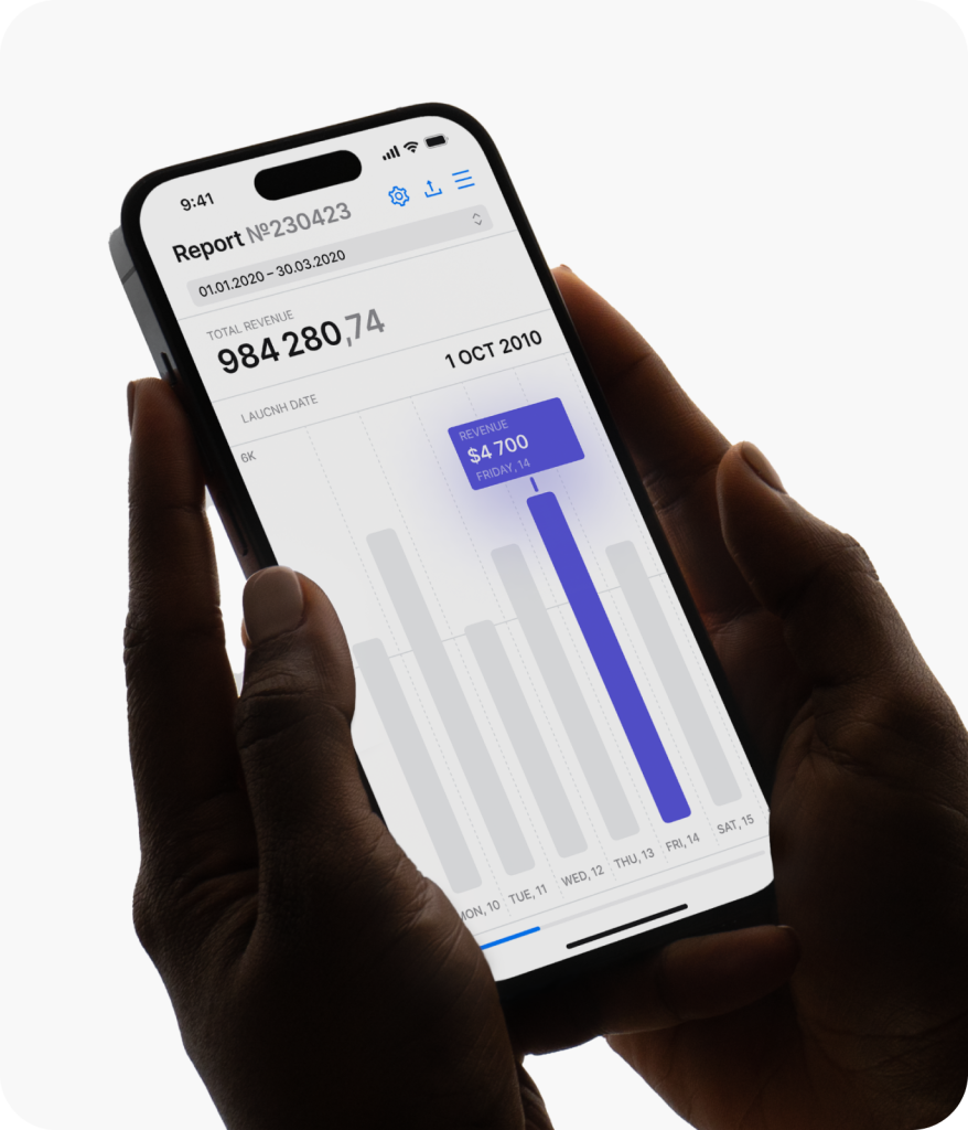
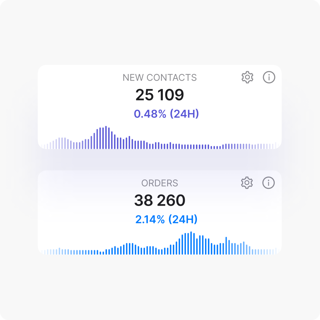
Data visualization
Redesigned the analytics dashboards to improve visual clarity and accessibility. The updated visualizations present complex data in a digestible, user-friendly format.

User testing
Tested the redesigned platform with users to collect valuable feedback. This helped validate the effectiveness of the new solutions and refine areas that needed further improvement.

Onboarding materials
Developed user guides and contextual onboarding content to support both new and existing users. These materials ensure smoother adoption and help users quickly get comfortable with platform updates.
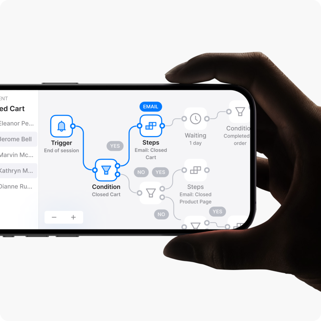
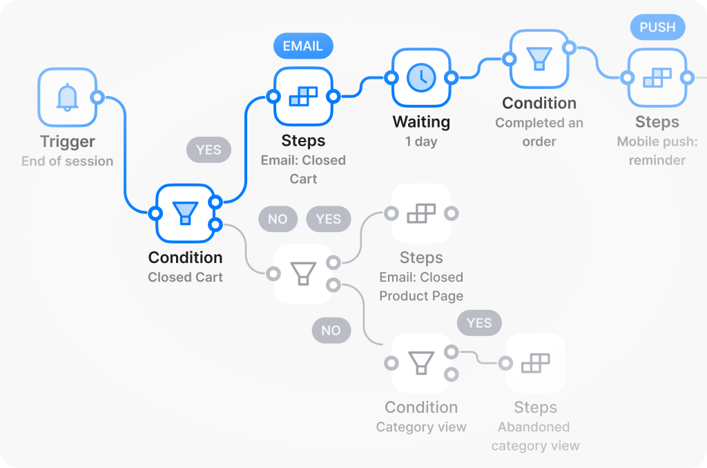
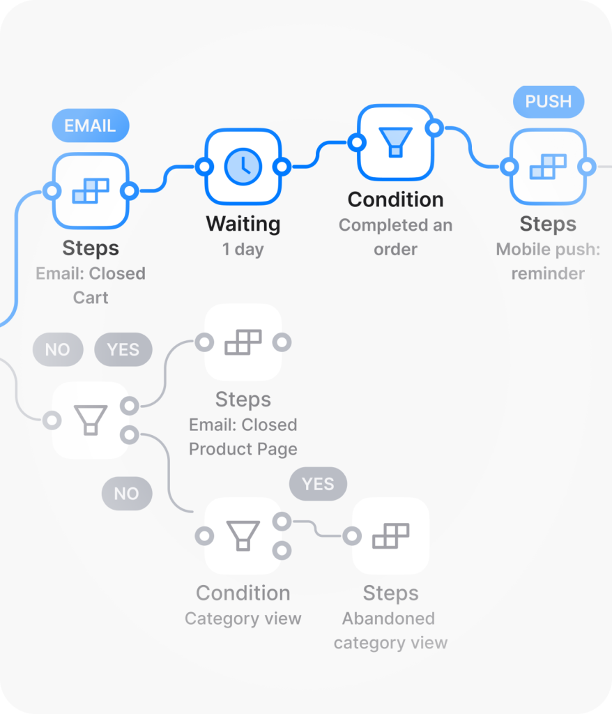
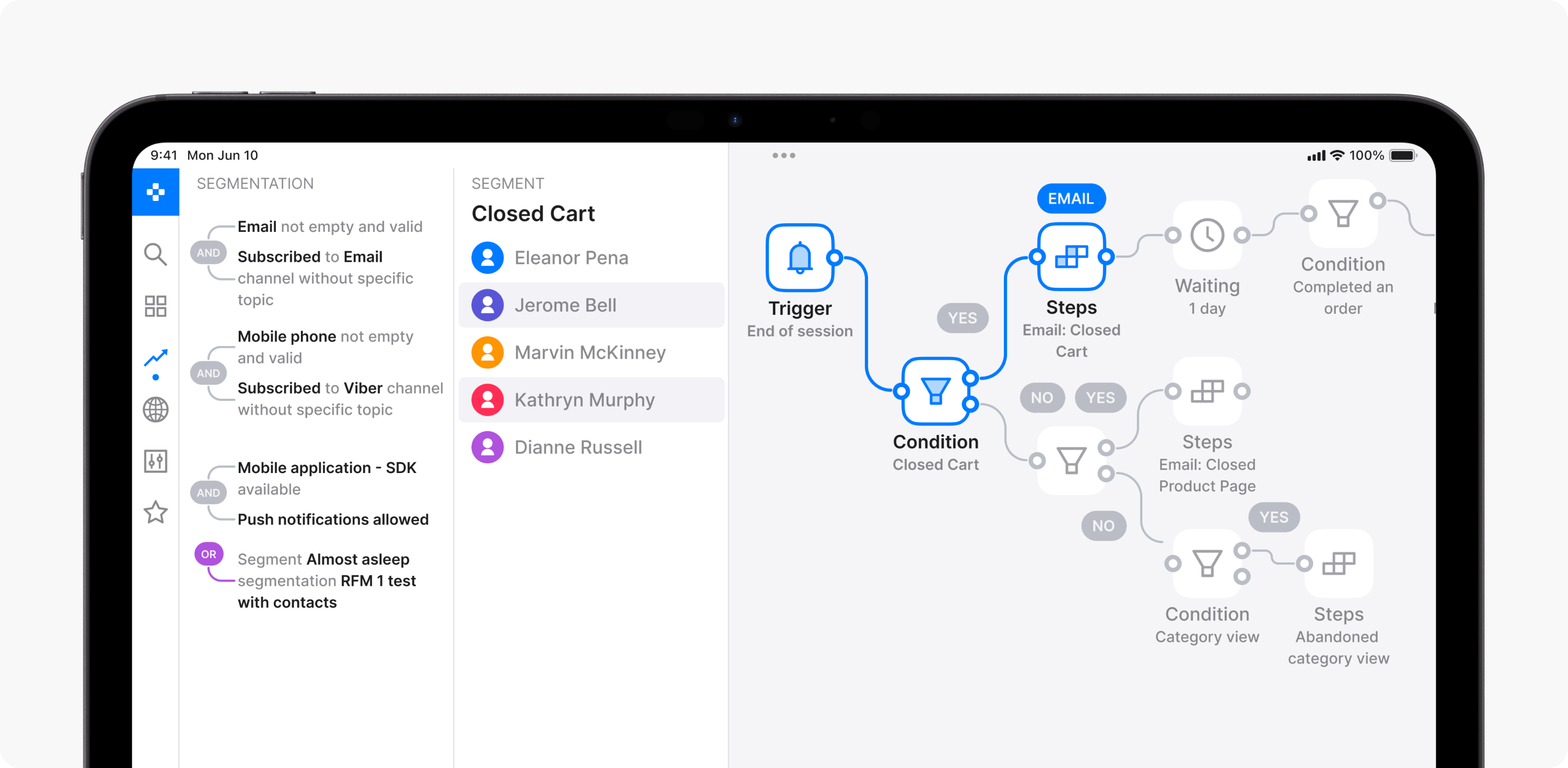
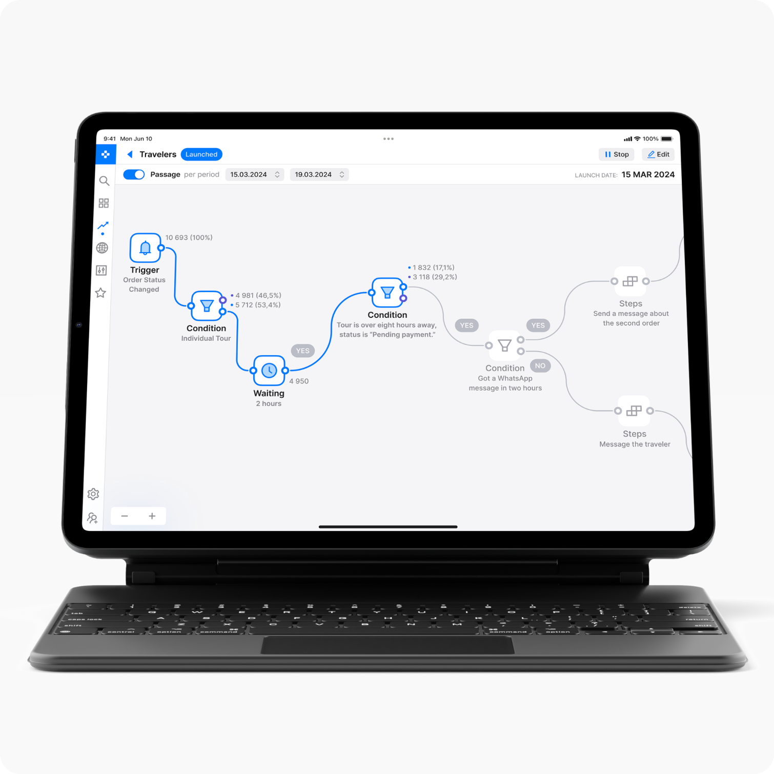
Interaction patterns
We conducted an in-depth analysis of the platform’s existing user experience, focusing on key areas such as email campaign setup, analytics management, and message personalization. Through user research and feedback, we identified friction points and usability challenges that hindered efficient interaction with the interface.
Each design improvement was validated through user testing to ensure the updated UI not only enhances functionality but also aligns with user expectations and real-world workflows.
UX research findings
All research methods and metrics provided actionable insights that informed our strategy for interface improvements. The findings from the UX research served as the foundation for the redesign, guiding decisions focused on creating a more intuitive and efficient user experience.


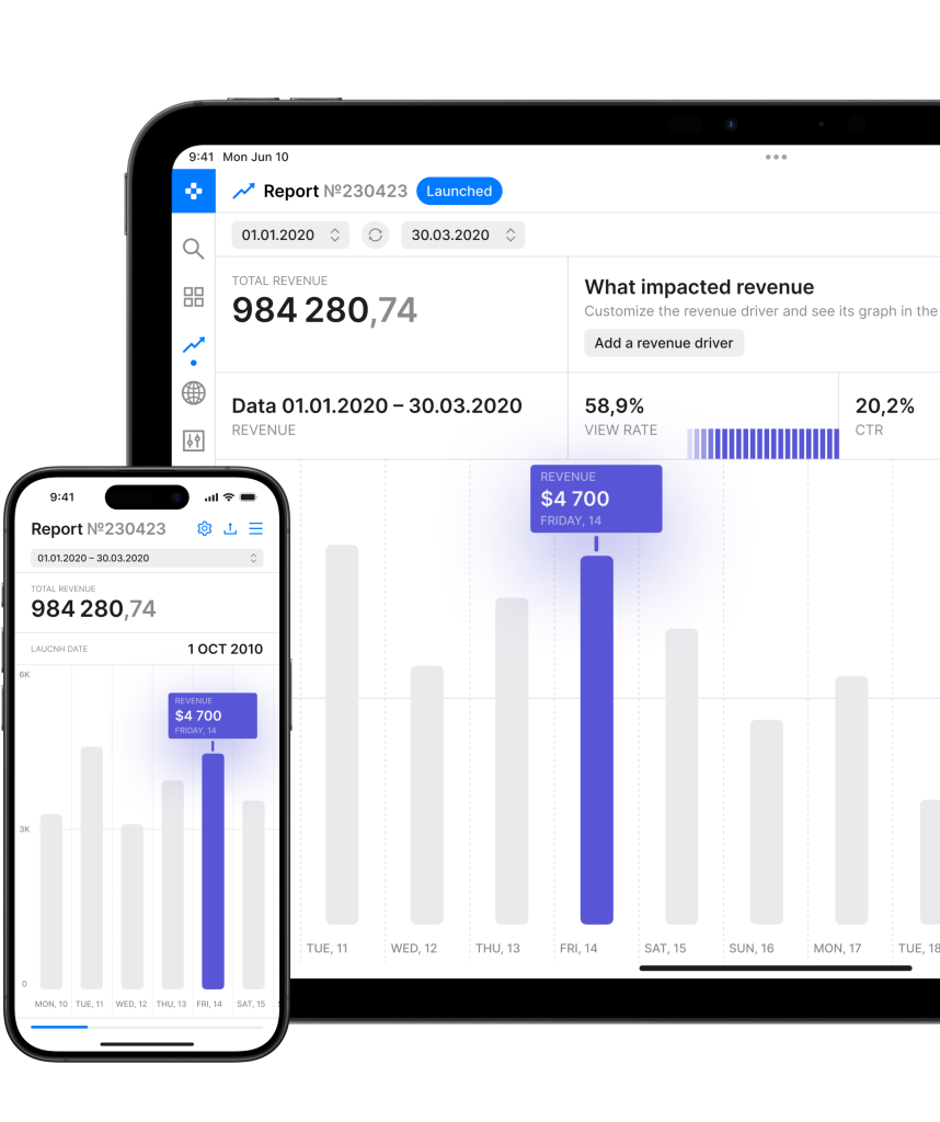
Data interpretation
We developed a data visualization system that offers an intuitive understanding of key metrics and their relationships. The updated visuals simplify analytics and empower users to make faster, more informed decisions.
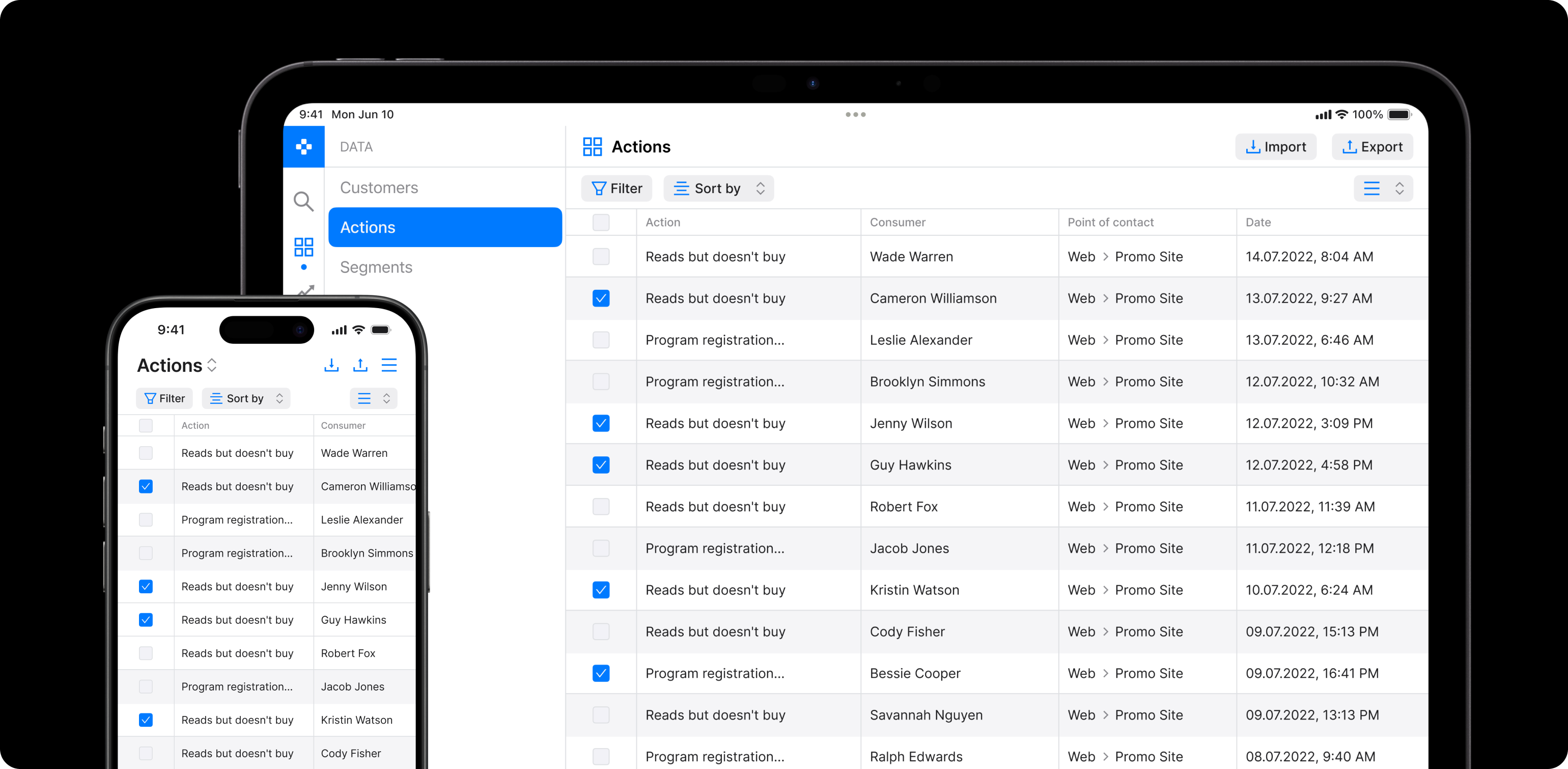
Scalable and adaptive tables
Our team developed a universal table template optimized for flexibility, clarity, and ease of use, regardless of the data’s size or complexity. Built on a modular grid system, the design allows users to add or remove columns without compromising layout consistency or interface usability.
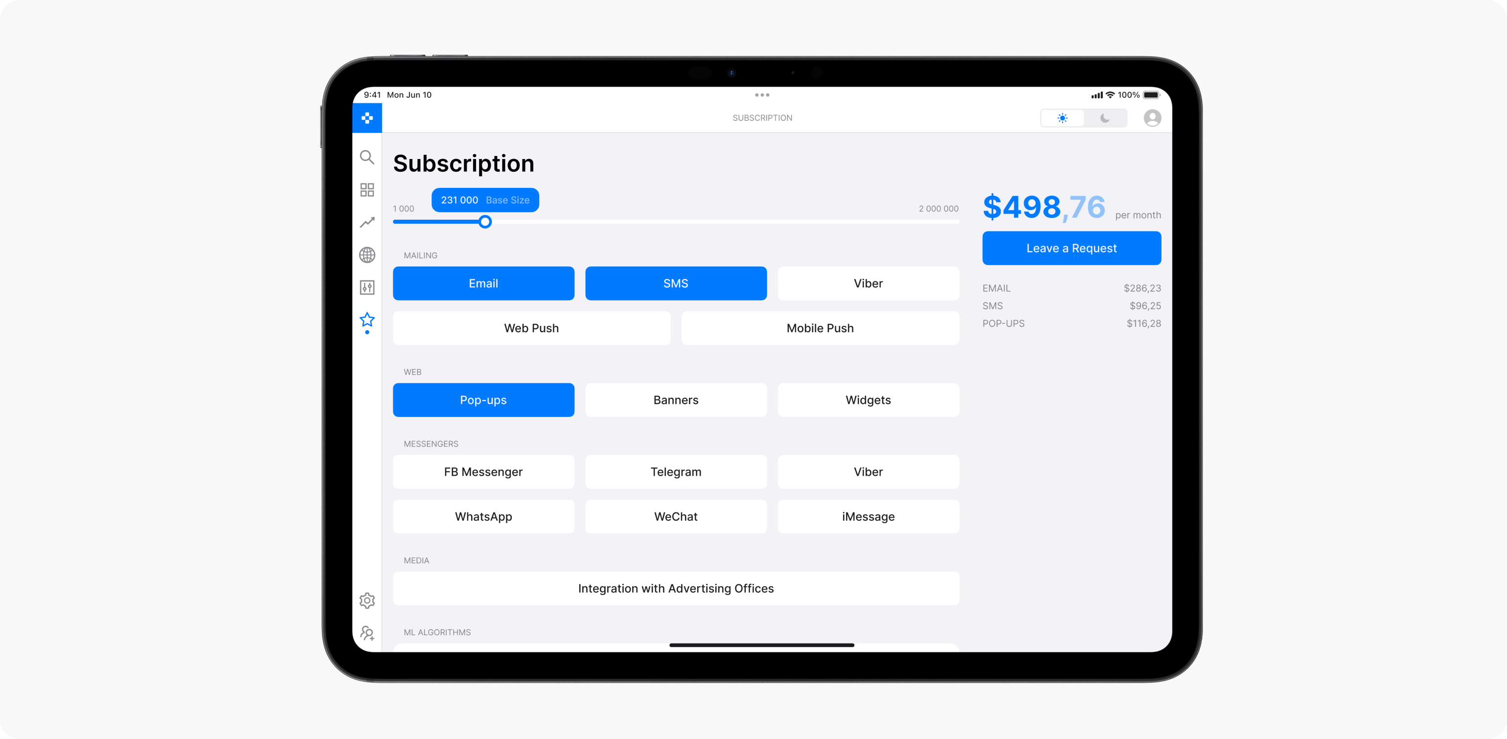
Scalable pricing based on usage and integrations
We introduced a dynamic pricing structure that helps users select the most suitable plan based on their actual business needs, maximizing value and scalability. Pricing is tied to key usage metrics such as the number of user records, volume of stored data, and system event counts. This approach enables companies to scale their plans in line with growth and evolving data demands.
We also factored in integrations with third-party systems like CRMs, marketing platforms, and analytics tools. Pricing adjusts based on the number of active integrations, offering flexibility for businesses that rely heavily on external services.
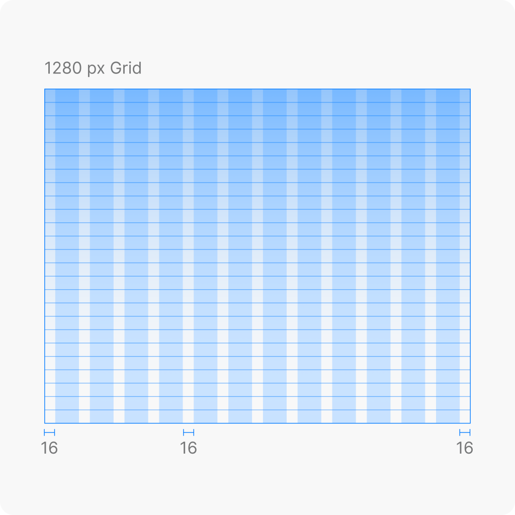
Modular design system
Our team created a modular and flexible design system that includes standardized components, clear and readable typography, adaptive color schemes, and detailed guidelines to maintain consistency across the platform.
The system is designed for scalability and long-term maintainability, allowing the product team to support a smooth user experience as the platform grows.


Visual language
Developed a cohesive visual framework that includes color palettes tailored to both functional and brand-oriented goals. Typography styles and scale were defined to ensure consistency and readability across all screen sizes.

Component design
Each interface component was built with defined states such as hover, active, and disabled. Interaction behavior was carefully considered, and subtle microanimations were introduced to enhance the responsiveness and feel of the interface.

Design tokens
Established a flexible system of design tokens, which are reusable variables for typography, spacing, color, shadows, and more. These tokens streamline implementation and make the design system easier to scale and maintain.

Testing
All components were tested in practical scenarios. Based on feedback from designers, developers, and end users, we refined the system to meet real usage expectations and workflows.

Documentation
To support consistent implementation, we created detailed guidelines with usage rules and examples. This ensured a smooth integration process across teams and future projects.
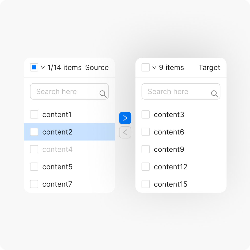
Scalable UI components
Developed a system of universal, modular components that can be reused across different parts of the platform, making the product easier to maintain and scale for the development team.
Icons
Designed in a unified style to match the brand’s visual language and ensure clarity across all screen sizes.
Dropdowns
Flexible component with support for multi-select, in-list search, and clear interaction states.

Buttons
Built with clear hierarchy and scalable sizing to fit various contexts, from forms to navigation.

Typography
Includes defined styles for headings, body, and labels to ensure readability and visual consistency.

Balancing familiarity and аunctionality
A key focus was maintaining a sense of familiarity by retaining essential functionality and preserving recognizable interface patterns such as layout structure. This helped ease the transition and ensured that improvements didn’t disrupt established user habits.

Layout
We retained the compact feel of the previous interface while refining the layout to preserve visual familiarity. This helped existing users adapt quickly to the updated experience.

Data export
We introduced export options in accessible formats like CSV and PDF, making it easier for users to transfer data and connect the platform with their existing business processes.
Project outcomes


Have a project in mind?
Let’s get in touch
Share your project idea with us! If our partnership isn't the right fit, we're happy to provide valuable insights that could still benefit you.
Get in touch